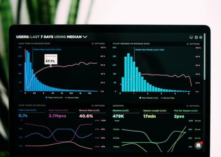
Histograms are used to summarize large data sets and to find patterns in data. Keep reading to learn more about histograms in statistics.
What is a histogram chart?
A histogram is a graphical representation of the distribution of data. It is created by dividing the range of values into a data set into intervals and then plotting the frequency of each interval on a graph. The height of each bar in the histogram corresponds to the frequency of that interval. Some examples of histograms include univariate histograms, bivariate histograms, and boxplots. Univariate histograms show the distribution of a single variable. This is usually done by dividing the data into intervals and then creating a bar graph for each interval.
Bivariate histograms show the distribution of two variables. This is usually done by dividing the data points into intervals and then creating a bar graph for each interval. The two bar graphs will then be compared to see if there is a relationship between the two variables. Boxplots show the distribution of a single variable, but they are different from univariate histograms in that they also show the median and the quartiles of the data. This can be helpful in identifying outliers in the data. All three of these histogram charts are great ways to visualize data points.
How do you make a histogram chart?
The best way to make a histogram chart is by using Excel. Excel is a software application that allows you to store and organize data in spreadsheets. Excel spreadsheets can be easily shared with other people, making them a great tool for collaborative work. Excel also includes powerful data analysis features that allow you to perform complex calculations and compile data into graphs and charts.

To make a histogram in Excel using the histogram tool, first type the data that you want to use for your histogram into a column. Then select the data. On the Excel ribbon, go to the Insert tab and click on the Histogram tool. Excel will create a histogram chart for you. To make a histogram in Excel using the Data Analysis ToolPak, type the data that you want to use for your histogram into a column and then select the data. Next, on the Excel ribbon, go to the Data tab and click on the Data Analysis tool. In the Data Analysis dialog box, select Histogram and click the OK button. Excel will create a histogram chart for you.
How are histogram charts used in statistics?
Histogram charts are used to help statisticians understand the distribution of data. A statistician is a mathematician who specializes in the collection, analysis, interpretation, presentation, and organization of data. Statisticians are employed in a wide variety of industries, including business, government, health care, and research. By looking at the histogram, statisticians can see how the data is distributed and make conclusions about it. For example, they can see if the data is symmetrical or skewed, and how the data is spread out. If a data set is symmetrical, it means that the data is evenly distributed. If a data set is skewed, it means that the data is not evenly distributed. This information can help statisticians decide how to best analyze the data.
Conclusion
Histograms are important in statistics because they allow for the examination of the distribution of data. This can be used to identify any potential outliers, as well as to understand the variability of the data. This information is important for making informed decisions about how to proceed with further analysis.


